
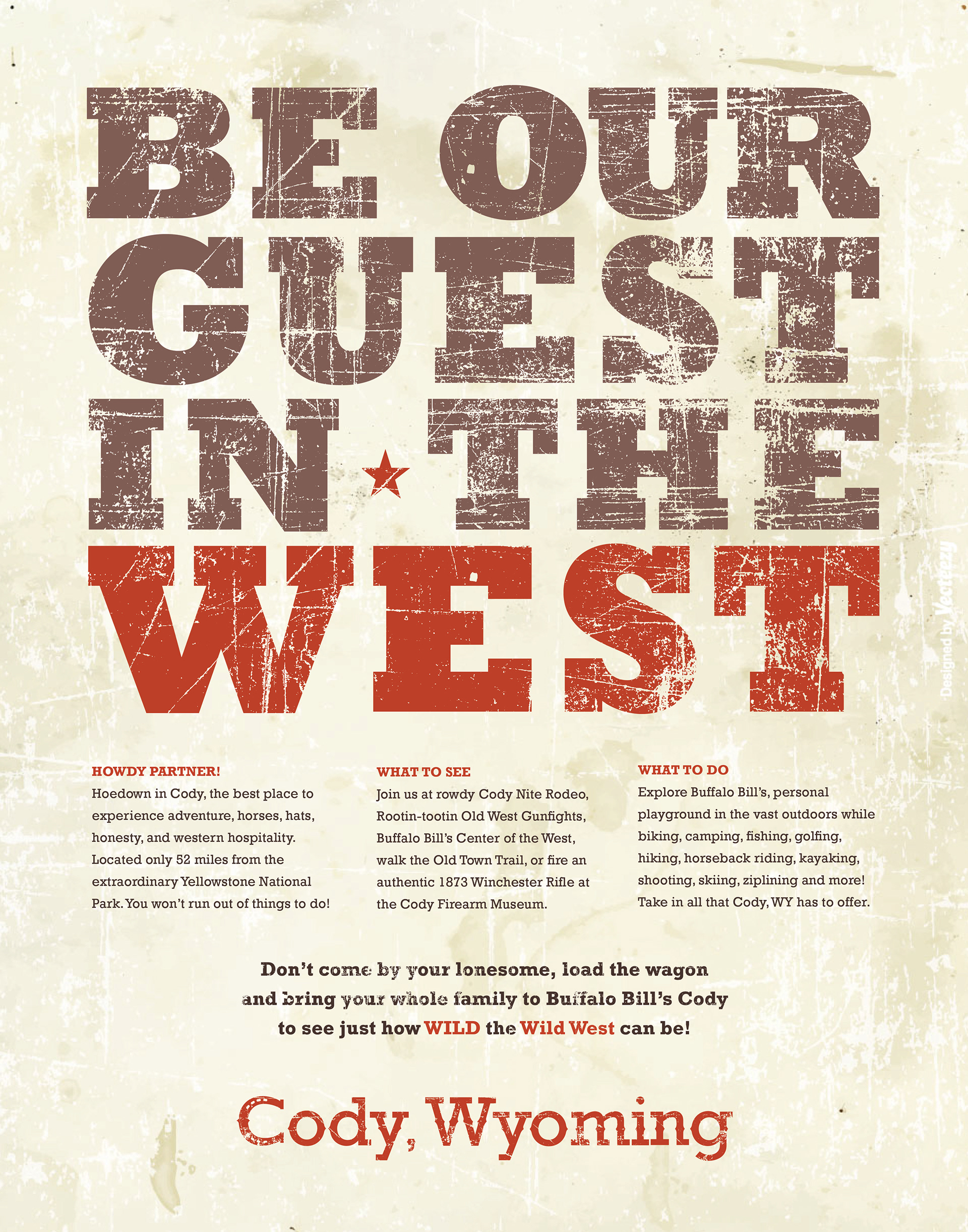
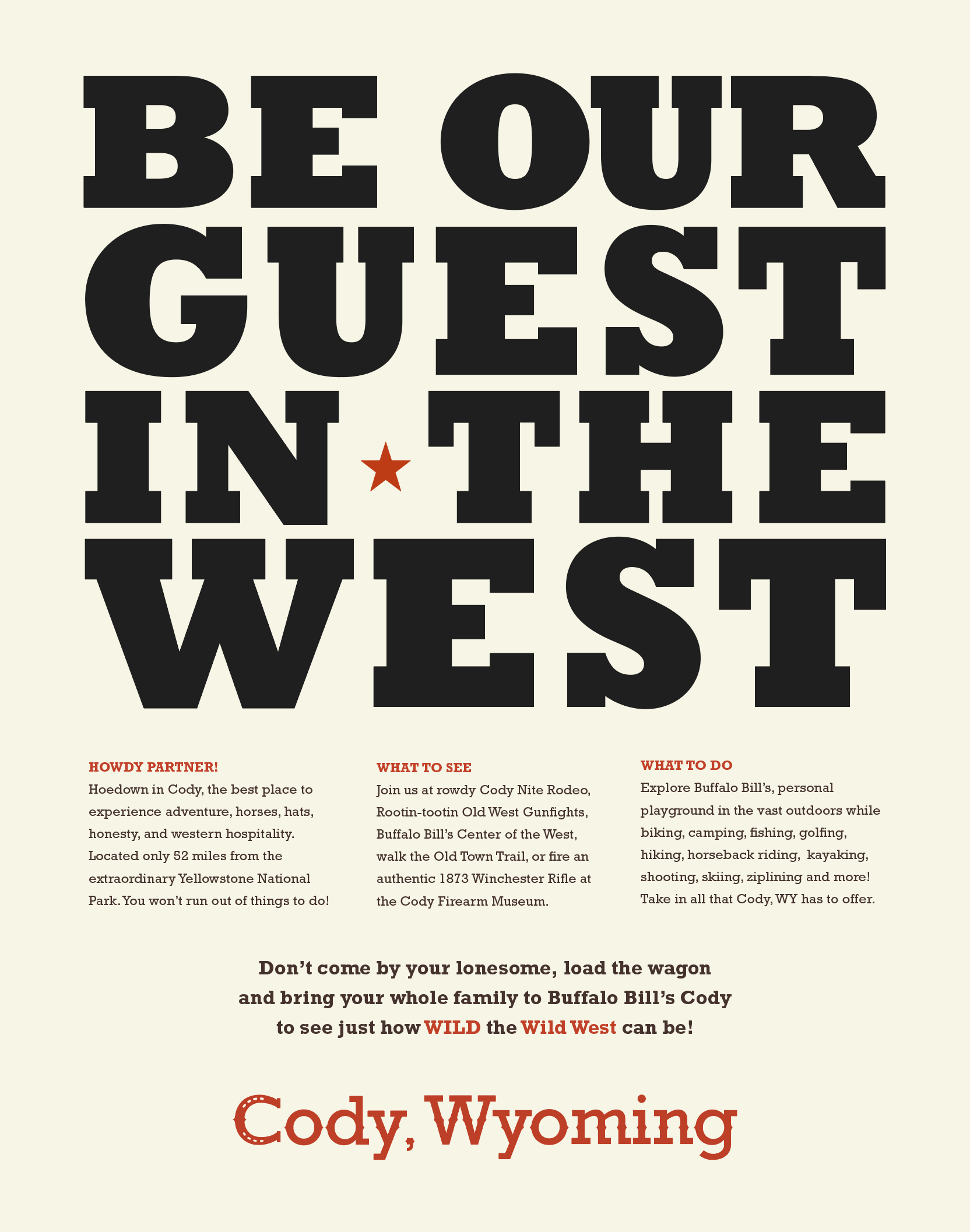
Cody city poster final
PROJECT NAME
City Poster
PROJECT TYPE
Typography
Part one was research, part two entailed creating a custom letterform, and part three consisted of all the elements combined to produce the final product. With all of this in mind, I created a word list that extrudes the essence of Cody to guide me through the process.
Word List for Cody.
Retro, Charming, and Sturdy
Part 1 - Research.
After choosing Cody, Wyoming, I started researching the town's industries, motto, personality, and history. It's the rodeo capital of the world and has authentic Wild West charm. The typeface needs to extrude that same retro-charm feel of Cody.
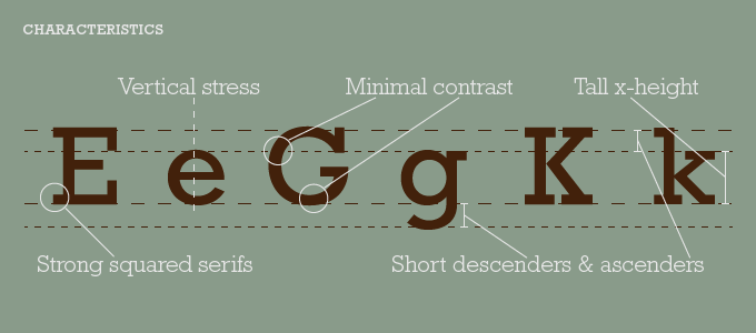
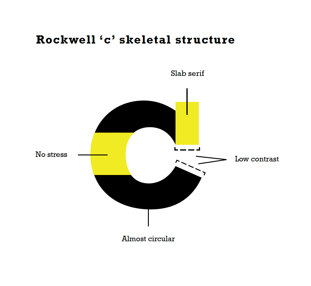
Rockwell type anatomy
Rockwell was used because it has strong squared serifs and has low contrast in its weight. It's great for headlines and has the same vintage-charm feel that represents Cody.
Key Word.
'HOEDOWN' is the keyword that was chosen.
Part 2 - Custom Letter
Customizing the first initial letter of your city (Rockwell C).
Rockwell 'c' type anatomy
Hand Sketches.
The Rockwell C is similar to a horseshoe. Many of my sketches play along that theme.
Vector Renders.
Here you can see the vector renders more clearly from the sketches.
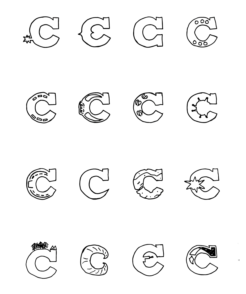
Letterform 'c' sketches
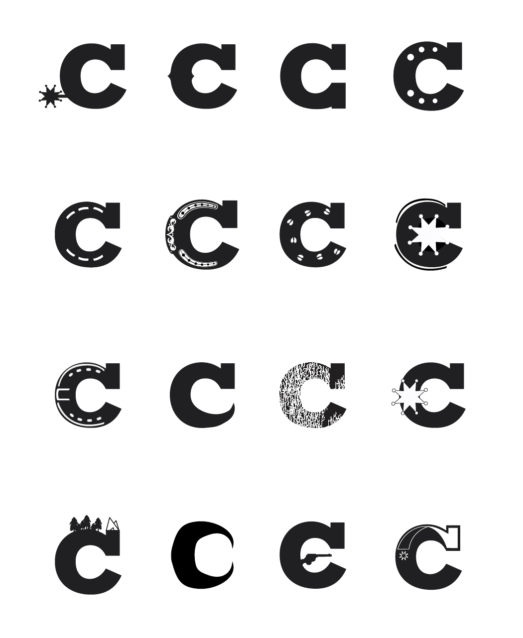
Letterform 'c' vector renders
Variations of Chosen Vector Renders.
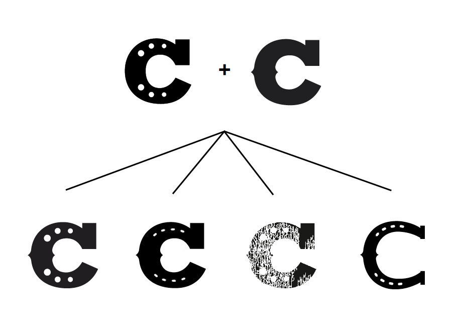
Letterform 'c' render variations
Additional Letterforms.
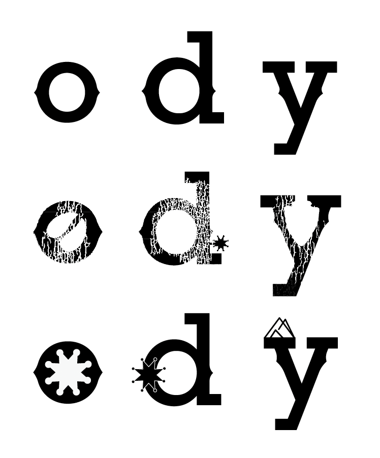
Other letterforms rendered variations
Final Render.
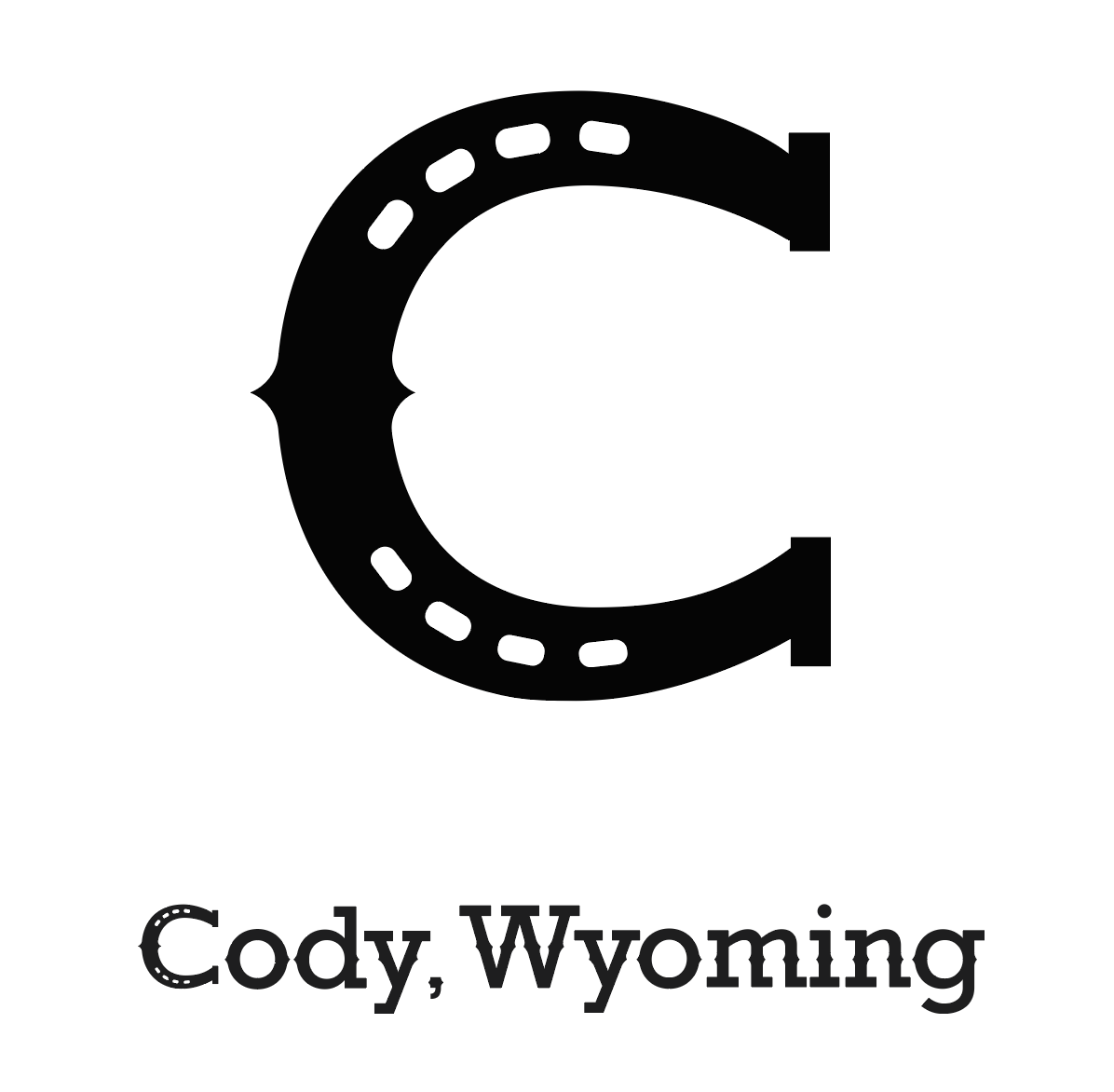
Final letterform render
Part Three - Poster.
Headlines Options.
Be our guest out west.
Rough, rowdy, & rodeos.
Authentic Wild West.
Load the wagon to Cody.
Be our guest in the west.
Experience Cody's Wild West.
Life isn't wasted on the saddle.
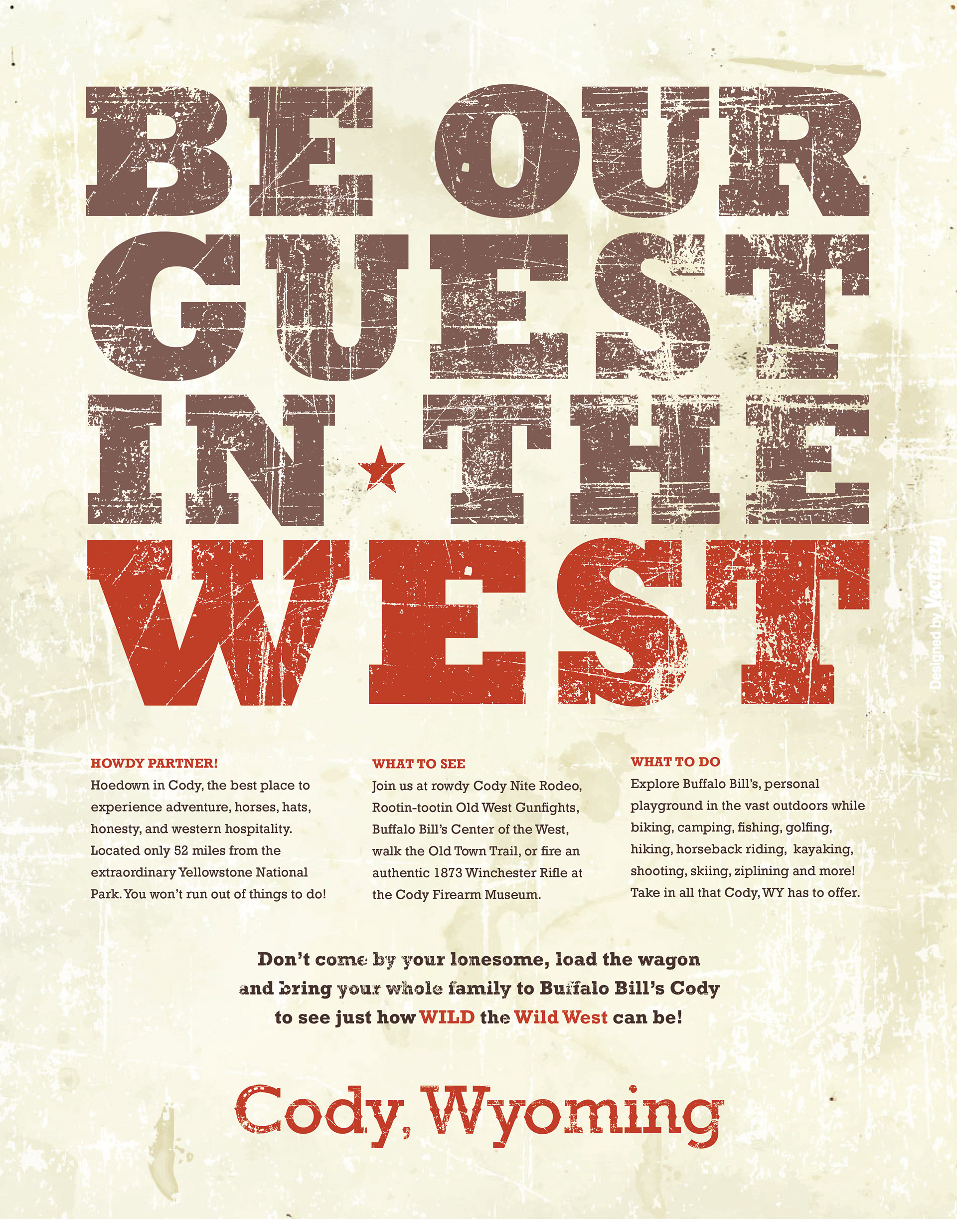
Drafts.
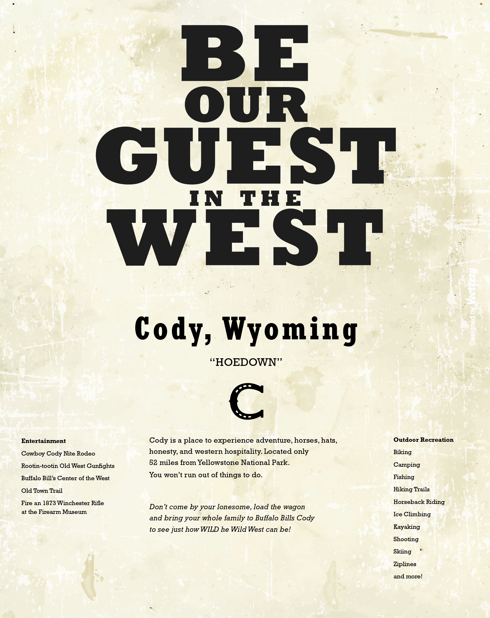
Cody city poster draft #1
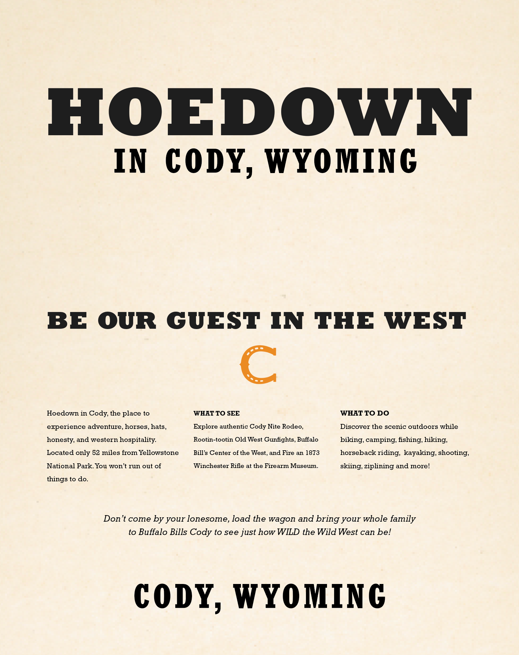
Cody city poster draft #2
Cody city poster draft #3
I wanted the poster to have a Western retro feel. I experimented with variations of colors, typographic textures, layout, and hierarchy, as well as background textures before I decided on my final.
Final
Cody city poster final